
Branding Highlights
RamQuest
RamQuest was a booming software company in the early 90’s, but over twenty years the brand had lost much of its impact. Product lines had expanded without hierarchy, leadership had evolved, and a general melancholy enrobed the brand both internally and throughout the industry.
Outside of the equity discovered in the corporate name, no other element was sacred and all were examined as part of a rebranding exercise. New branding assets, voice, and positioning were developed to help convey the new spirit of the company. The new RamQuest emerged to industry-wide applause.

Rebranding workshops can offer valuable insight, so RamQuest held a number of sessions that included the entire company, exploring the organization’s culture, customer journeys, differentiators, and more. This information helped to define RamQuest’s character, arena, positioning and ultimately shaped the brand.

After conducting workshops and industry reviews, RamQuest considered a series of mood boards to find the right tone that would convey their new character traits and mission. This one was selected for its ability to invoke a casual tone with a focus on artisanal, hand-crafted vibes.
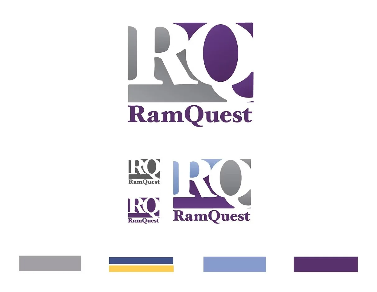
Then, logo iterations evolved to a color-blocked mosaic that celebrated the company’s initials: RQ, for which they were already more commonly known in the industry.


This rebranded advertisement mockup combines the craft-like design features with the new color palette and tones to set a new mood for the company.
Sweet Deal
Pop-Candy wanted to merge the worlds of candy and art with a non-profit spin. This project delivered a branding campaign featuring competitive research, a defined target audience, a creative message and both virtual and real-life brand experiences.
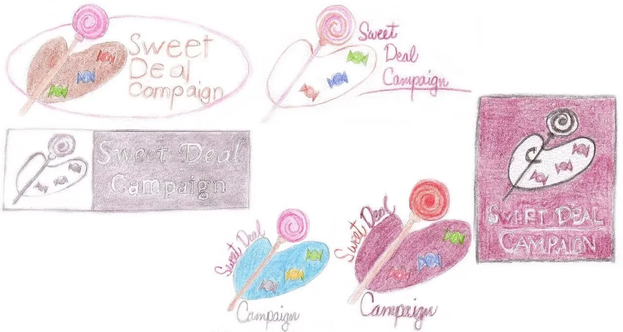
Initial logo sketches focused on merging art and candy elements with pops of bright color to emulate both the sweet treats and vibrant craft mediums.

Multiple mood boards were developed to hone brand assets. This option was an early draft and focused more on feminine youthfulness. The final mood board featured brighter colors and more playful typefaces.
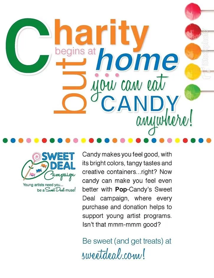
This sample advertisement helped Sweet Deal to envision the campaign’s look and feel as it highlights the brand's voice, along with photography, typography, and color palette.
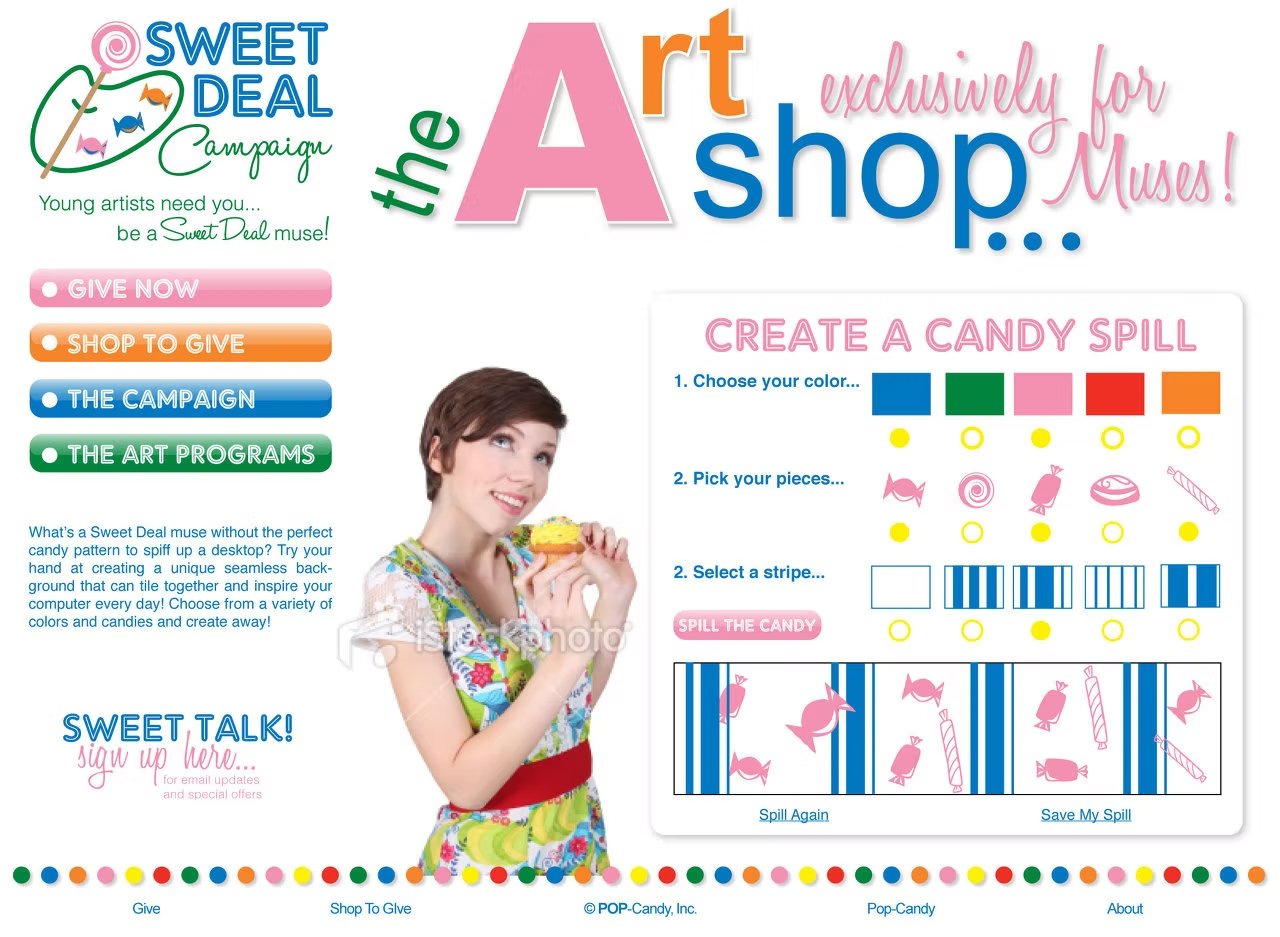
This mock website page delivered a web activity for young artists and donors who were the target audiences for Sweet Deal.
Resurrection Life NYC
Branden and Jenn Petersen moved to New York City after pastoring a Dallas-area church for seventeen years, to plant a new church: Resurrection Life NYC, in the Upper East Side neighborhood of Manhattan. They needed a brand identity that could compete with the noisy city offerings while remaining true to their vision of a place where all could belong.


Used primarily for donor-development, this twelve-page prospectus was designed as part of the brand launch and featured magazine-like layouts to engage the reader in their vision for Resurrection Life, NYC.

Moodboards helped to define a balance between elegance and comfort, a niche Resurrection Life, NYC needed to hit perfectly for their target audience.
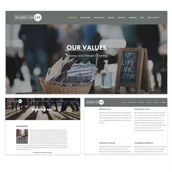

Resurrection Life NYC needed branded assets for both virtual and physical experiences. Website page templates allowed the church to deliver a dynamic user experience and multi-purpose signage that evoked the brand’s color palette, imagery, and elements of nature was a key design project.
Cooper and Amador
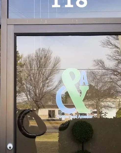
Newly partnered CPAs needed help to bring their company to life. As a locally owned, family-oriented company Cooper and Amador were dedicated to providing personal and quality work for their community and they needed a brand that supported their mission. Playing with their initials and their expertise led to an approachable and trustworthy identity for their company.

Cooper and Amador knew they wanted energetic vibes but the question became how much was too much. Learning about color systems and applying them to the branding was key to finding the right balance for the multi-generational parnters.
As CPAs, traditional stationary wasn’t just a whim, it was necessary and helped communicate with their stakeholders while also offering an opportunity for brand impressions outside of their physical space.

The bright color palette and color-block logo design stood out in the dark shades of their building complex.
RQUG
RQUG, the self-governing user group for RamQuest's solutions, was ready to better align their identity with RamQuest's rebranded look. Their outdated logo had diminished in value with the rise of event-centered logos, leaving the group without a way to brand group-wide information and leadership wanted to create a "splash" to infuse fresh energy within membership.

Several ideas were considered for the logo, but in the end, the human elements from the previous logo were determined to hold the utmost value, and were incorporated as three circles, reimagined to visualize the idea of community.


The new logo was celebrated at a mutli-day event, including a lanyard button give-away. In the assembly, the logo launch video played before logo'd beach balls were tossed into the audience to foster a festive atmosphere. A multi-day scavenger hunt app was designed to highlight the new logo's message of connection and event signage was also marked with the new group logo to continue reinforcing the new brand.
Runway Theatre
For Runway Theatre, it wasn't about a shiny new logo or pretty new font. As the theatre approached 40 years of existence, formalizing its brand was about drilling down into the very essence of the theatre and ensuring decisions were made in a strategic way, to best support the mission, and then to communicate this accurately with target audiences in the most authentic way possible.

A volunteer committee met over an entire year to determine the theatre’s brand character, arena, and customer journey strategies. One task involved categorizing a number of attributes to various positioning options to determine the optimal choice.
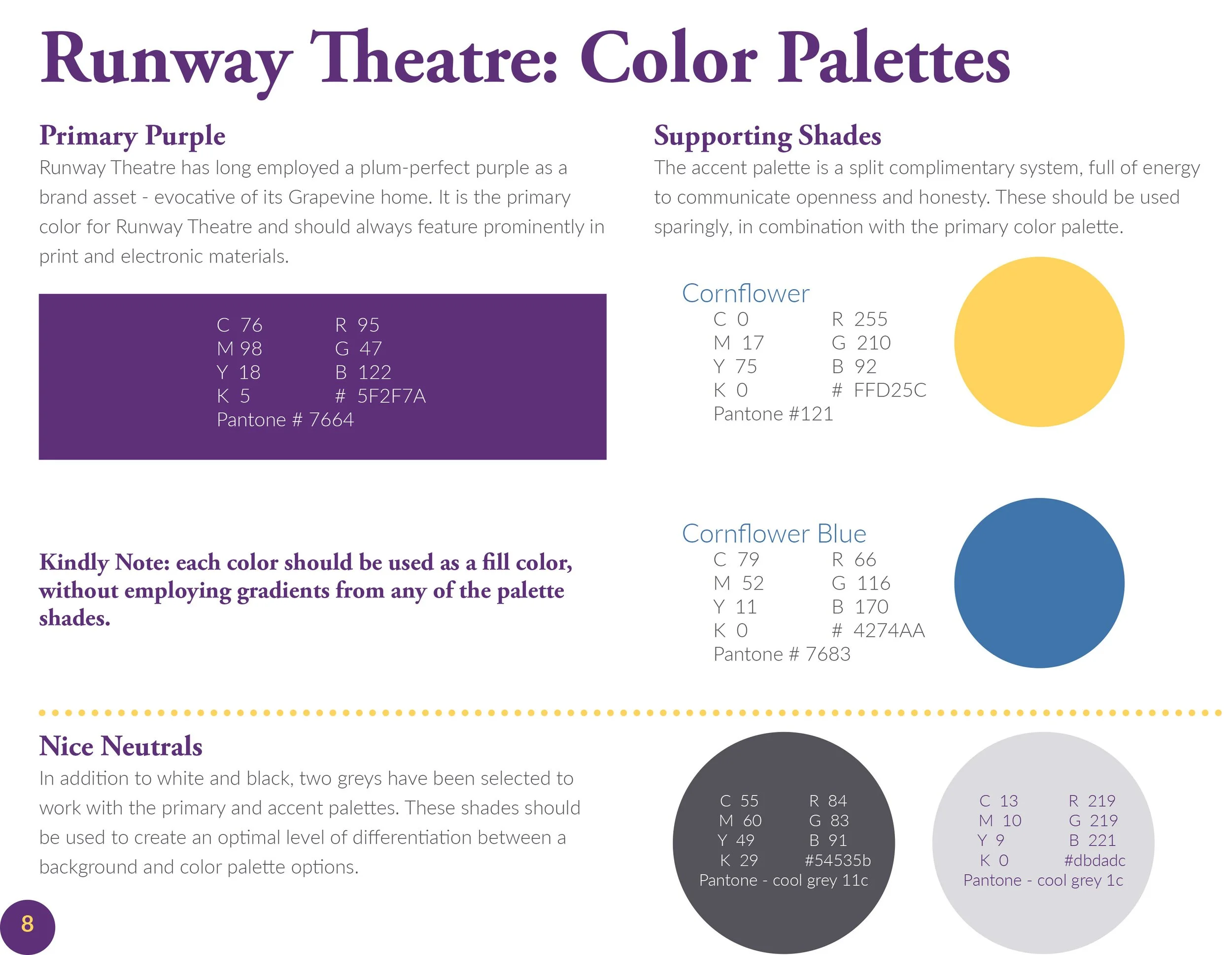


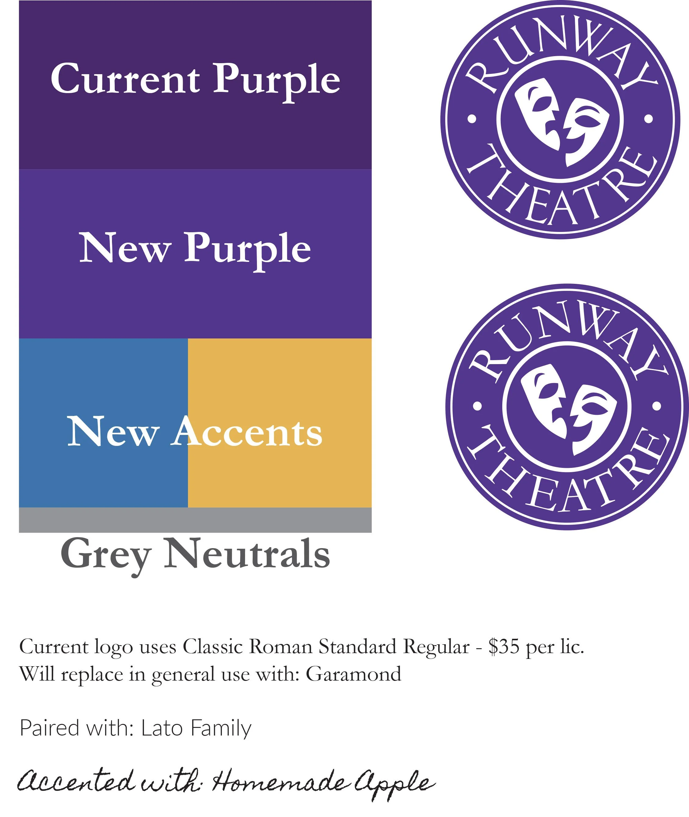
Minor adjustments were made to the existing logo to align Runway Theatre’s signature hue with an expanded palette and Google font-families were selected that would work with the theatre’s non-profit management platforms.

As a rotating, volunteer hierarchy, a Brand Guide was crucial to protect the evolution of Runway Theatre’s brand from season to season. Key information included color and font information along with details on the target audiences, positioning, arena competitors, and assets like Runway’s brand voice.